IQ-QMS
Queue Management System

IQ-QMS — a SaaS solution for efficiently managing customer queues in business branches
- Feedback Gathering
- Design System
- Dashboard Design
- Kiosk App + Development
- TV App Design + Development
- Operator Platform Design
Challenge
Readcast is a small company that offers customer software development solutions to clients in the banking industry. One of our successful endeavors includes the delivery of the IQ-QMS solution to one of the largest banks in Moldova. Our client's goal was to enhance user experience and develop new features aligned with their business requirements. To achieve this objective, we embarked on redesigning the existing solution and introducing new functionalities, such as an online appointment scheduling feature.
Approach
To deliver these outstanding results, we adopted a comprehensive approach. First and foremost, we gathered feedback from our clients who had been using the IQ-QMS solution at their bank branches for nearly a year. Furthermore, I decided to take a hands-on approach by analyzing the entire process at our clients' branches. This involved conducting a quick interview with a few of our clients' customers to understand their experiences with the IQ-QMS solution and to identify any pain points or areas for improvement. This provided us with valuable insights into the needs of our users, enabling us to make informed decisions and develop solutions that address their specific requirements.
Feedback
Gathering
We have gathered extensive feedback from both our clients and their customers, enabling us to make informed decisions and redesign a modern, usable, and functional solution. Our approach involved not only quantitative data analysis but also direct user interviews and guidance to gain a better understanding of their behavior and needs.
Challenge
Solution
Feedback directly from client
In order to gain a deeper understanding of our client's requirements, we held multiple sessions with stakeholders to gather feedback regarding the functionality and overall experience of using the solution in their branches. We concluded that a redesign was necessary to enhance the solution's usability and overall appeal for the end-users.
Feedback from client's customers
We made the decision to spend multiple days at our client's branches, closely observing how both customers and operators interacted with our solution. This immersive experience allowed us to gather a wealth of valuable feedback and pinpoint areas that needed improvement in the current system. For instance, we observed that elderly customers had difficulty seeing their ticket displayed on the TV, and some screens were of low quality or placed in areas with harsh lighting or direct sunlight. These findings led us to make necessary adjustments to our interfaces.


Quantitative data of client customers
We requested various data points about our client's customers, such as demographics, user type (business or individual), average service time, and daily queue length. This information enabled us to gain a deeper understanding of our target audience and make informed decisions based on their needs and preferences, ultimately leading to a more tailored and effective solution.

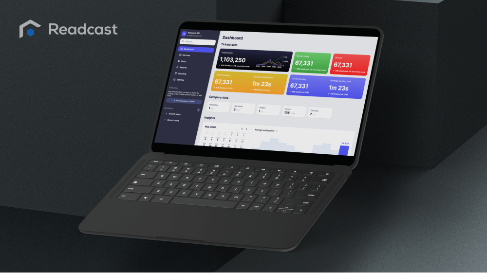
Design scalable and consistent user experiences
Based on our extensive research and feedback collection, we implemented a comprehensive design system for the dashboard that prioritizes usability, functionality, and visual clarity. We also incorporated consistent branding and design elements throughout the dashboard, creating a cohesive and professional user experience. The design system is flexible and adaptable, allowing for future updates and modifications as needed.


Modern and easy to use interface
The dashboard design we developed is a culmination of extensive research, feedback collection, and user testing. It features a modern, intuitive interface that prioritizes ease of use and efficient functionality. We incorporated a clean and consistent design aesthetic throughout the dashboard, featuring clear typography, easily recognizable icons, and a color scheme that is both visually appealing and easy to read. Additionally, we ensured that the dashboard is easily adaptable to different screen sizes and devices, allowing for a seamless user experience across various platforms.


Achieving efficiency, accessibility, and aesthetics
After analyzing user feedback, we recognized that the Kiosk app's design required an update, given that it serves as the primary interface for users initiating the flow. With this in mind, we made significant changes to the app's design, including enlarging frequently used services, increasing hotspot sizes, and improving font readability. Moreover, we added a new feature that enables users to access estimated wait times, empowering them to make informed decisions about joining the queue and reducing paper waste by decreasing ticket printing. I coded the user interface according to the new design and ensured that it is pixel-perfect and aligned with the design specifications.


Enhance the ticket calling experience
We've revamped the TV web app, implementing a new color scheme that significantly improved readability. We also increased the font weight to enhance legibility, and rearranged the layout to create a more user-friendly and visually appealing interface. I've developed the interface of the TV web app and tested it at several branches to ensure that it works and feels as intended.

Easier to serve customers
After receiving valuable feedback from our client's operators, we redesigned the operator interface to ensure it is intuitive and user-friendly. Our focus was on creating an accessible interface that would allow operators to concentrate on interacting with customers instead of navigating a complex UI.


More works
Have a look at more works, including dashboards and data visualisation platforms, demonstrating a strong ability to convey complex financial information in a clear and user-friendly manner for a wide range of audiences.